
Prioritizing Your Roadmap Items by Delighting your Customers – Part 2
Step by Step Guide on How to prioritize roadmap elements based on customer delight against feature investment using the Kano Model.

For every Product Manager, creating a product roadmap with the right features is crucial, but it's important to determine which features will make your future customers happy.
You have a never-ending backlog of feature requests from various stakeholders. But you can't build everything at once (and honestly you shouldn’t.) So you need data to support your decisions and somehow make the right choices.
This is not a exclusively Product Management topic, it matters to UX Design and other jobs, as customer satisfaction is the end goal of many companies. So if you’ve missed the first part go check it out before going deeper into this topic (I did some changes to that post)👇
Prioritizing Your Roadmap Items by Delighting your Customers – Part 1

Starting to work on new products can be exciting and motivating. The product team is very enthusiastic about the ideation and brainstorming sessions. Everyone has fresh and innovative ideas to make this product succeed. But the list of elements to consider for development grows and grows.
In Part 1: Introduction to Kano Prioritization Model
What is the Kano Model
The 5 attributes of the Kano Model
In general terms, how to implement Kano in your process
Disadvantages of the model and when to really use it
Delighters and excitement will decay over time (new edition)
The ultimate goal for UX is that users enjoy using your product (video)
In Part 2: Kano Step-by-Step Guide + Template
Scoping the target features and the audience
Unraveling customers expectations with a Kano Survey
Evaluating the Kano Survey results
Analyzing the results with Discrete Analysis
Exploring the data with Continuous Analysis
Prioritizing features
Scoping the target features and the audience
Before sending a survey to anyone, we need to figure out what are the product features we want to study and what are the type of users we need feedback from. Simply because we can’t just bombard all of the users with the entire product backlog and expect accurate results.
Segmenting customers strategically
When selecting who will participate in the study, it's important to consider customers’ demographic, logical cohort, or persona to which they belong. This can significantly reduce noise in your analysis and help you understand distinct reactions to different features.
There are many possible segmentations to choose from, and it's important to choose the one that makes sense for your product. For example, if you’re trying to prioritize B2B SaaS features, it’ll be very possible that the attractiveness may vary between an enterprise customer and a small business.
Choosing some features, not all of them
When choosing features to study for customer satisfaction, focus on those that provide meaningful benefits to the user. Avoid including items such as technical debt payment, sales/marketing tools, reporting systems, or design refresh in the Kano analysis. Limit the number of features in your survey to improve participation and attention levels. Kano analysis should not be used to justify not fulfilling internal stakeholder requests.
Unraveling customers expectations with a Kano Survey
To understand more about what our customers are expecting from the product we need to create a Kano survey, make a list of all the features we plan to include in our product and determine their importance to users. That help us to range features from non-essential to must-haves.
There’s 3 aspects we want to evaluate for each feature:
Functional Aspect: How our users feel if they have the feature
Dysfunctional Aspect: How our users feel if they don't have the feature
Importance Aspect: How important is the feature to our users
These are very specific questions with no open-ended answers:
How will you feel if you have this feature?
How will you feel if you did not have this feature?
How important is this feature to you?
To measure the results, we provide to our respondents a list of possible answers. The format of the answers could be:
I like it
I expect it
I am neutral
I can tolerate it
I dislike it
This is how the format should look like (changes the format from previous post to make it easier to understand.)

To get better answers, make better questions
To make the Kano study effective, it is important to write clear and concise questions, with each question representing a single feature. Questions should be phrased in terms of benefits to the user, rather than product capabilities.
Also, it’s important to be careful with the wording of every question, specially when you’re differentiating between the functional (positive) and the dysfunctional (negative) aspects. Because, the dysfunctional question is not always the complete opposite of the functional one. Instead, it is simply the lack of that particular functionality. So, be cautious when using question pairs to ensure that you aren't inadvertently creating confusion or misunderstanding.
Asking about how important the feature is
For the importance aspect, include a question asking customers how important a feature is to them, as it can help distinguish relevant features from less important ones and understand their impact on customer decisions. Let the respondents to choose a number between 1 and 9 to measure it.

Here is an example with an hypothetical feature for a task manager application:

Testing the survey with team members
A good way to avoid confusion between the respondents and get better data, is to test the questionnaire with our team members before surveying customers massively. It can be very surprisingly to us how our team members interpret each question in a different way. This will help to restructure the survey and polish it saving a lot of time and frustration.
Evaluating the Kano Survey results
One of the coolest things of the Kano Model is that evaluates the importance of functionality and lack of functionality to determine customer needs. The following evaluation table is used to categorize the answers and determine customer preferences.

These categories will help us to understand:
When users did not understand the questions/features we are describing.
When our proposal is the opposite to what the users want.
Classifying the answers in categories
Must have (Must-be): These features are basic expected by customers and they dislike not having them.
Performance (One-dimensional): Preferred by customers, these are very straight forward because they like them and dislike not having them.
Attractive (Delighters): These features are often different and appealing. They bring something new to the table and customers like having something good they didn't expect.
Indifferent: These features are not interesting. Users don’t love neither dislike them, they just don’t care and feel neutral about their existence.
Doubtful (Questionable): This category covers conflicting answers such as getting “Like” and “Like” to both questions (Functional and Dysfunctional). This suggestion comes from Fred Pouliot in 1993 and he also stated that getting a majority of “Questionable” answers there may be an issue with what is being asked.
Undesired (Reverse): If users answer they dislike the Functional (Positive) question yet they Like the Dysfunctional (Negative) one, it means they simply don't like what you’re offering to them and they want something else.
Analyzing the results with Discrete Analysis
In Kano context, the purpose of using Discrete Analysis is to understand and classify these preferences into specific categories (the ones of the Evaluation table), which are essential for prioritizing product features and making informed decisions about product development and improvement.
The Discrete Analysis Steps:
Get to know your respondents: If you have different customer profiles, start by dividing the respondents based on their demographic or persona criteria. This helps you understand different groups and their preferences.
Put answers into categories: Take each respondent's answers and put them into categories using the Evaluation table. This helps you organize and analyze the data more effectively.
Count the responses: Tally up the total number of responses in each category for each feature and demographic. This gives you an overview of how many people fall into each category.
Find the most popular category: Identify the category that appears most frequently for each feature. This category represents the mode or the most common response.
Resolve close results: If there are close results between categories, use a simple rule to decide. Follow this order: Must have (essential) > Performance (important) > Attractive (exciting) > Indifferent (not significant).
Consider importance ranking: Take the average ranking for each feature into account. This helps you understand the overall importance of each feature to the respondents.
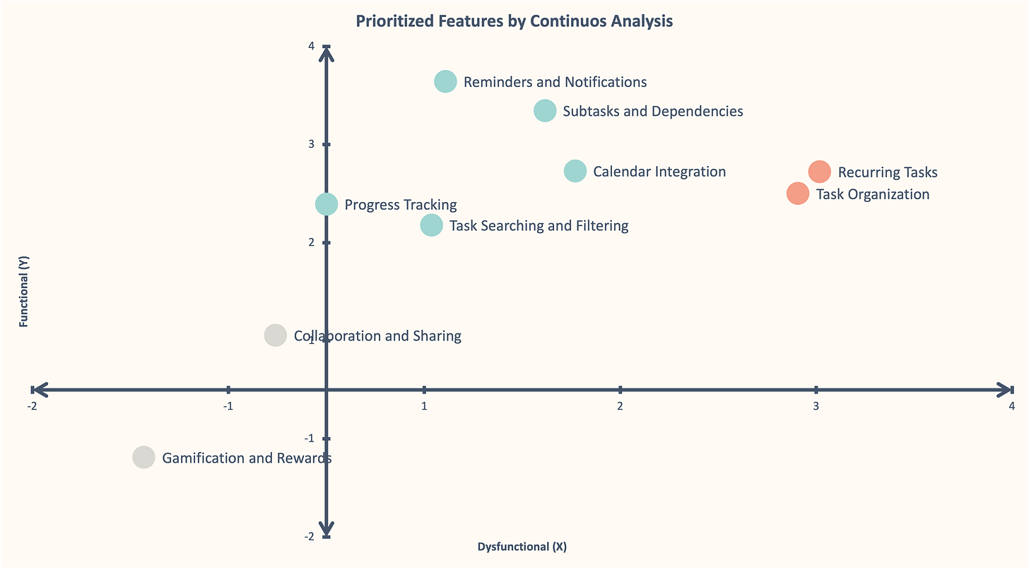
Exploring the data with Continuous Analysis
Even though doing a Discrete Analysis is a good start, it has limitations. Like losing valuable information, lack of variance, and treating all responses equally. However, a Continuous Analysis methodology proposed by DuMouchel addresses these issues and can be easily calculated using a spreadsheet.
Scoring each answer
To be able to measure, we need to transform each answer into a numerical value:
Functional: -2 (Dislike), -1 (Tolerate), 0 (Neutral), 2 (Must have), 4 (Like)
Dysfunctional: -2 (Like), -1 (Must have), 0 (Neutral), 2 (Tolerate), 4 (Dislike)
Importance: 1 (Not at all Important), …, 9 (Extremely Important)
The Dysfunctional scale measures satisfaction potential, with higher scores indicating more potential satisfaction. Disliking something on the scale means there is strong disagreement with its absence and would provide more satisfaction if included. The asymmetrical scale emphasizes the positive end because those categories hold stronger responses, that’s why is starts from starts at -2 instead of -4.
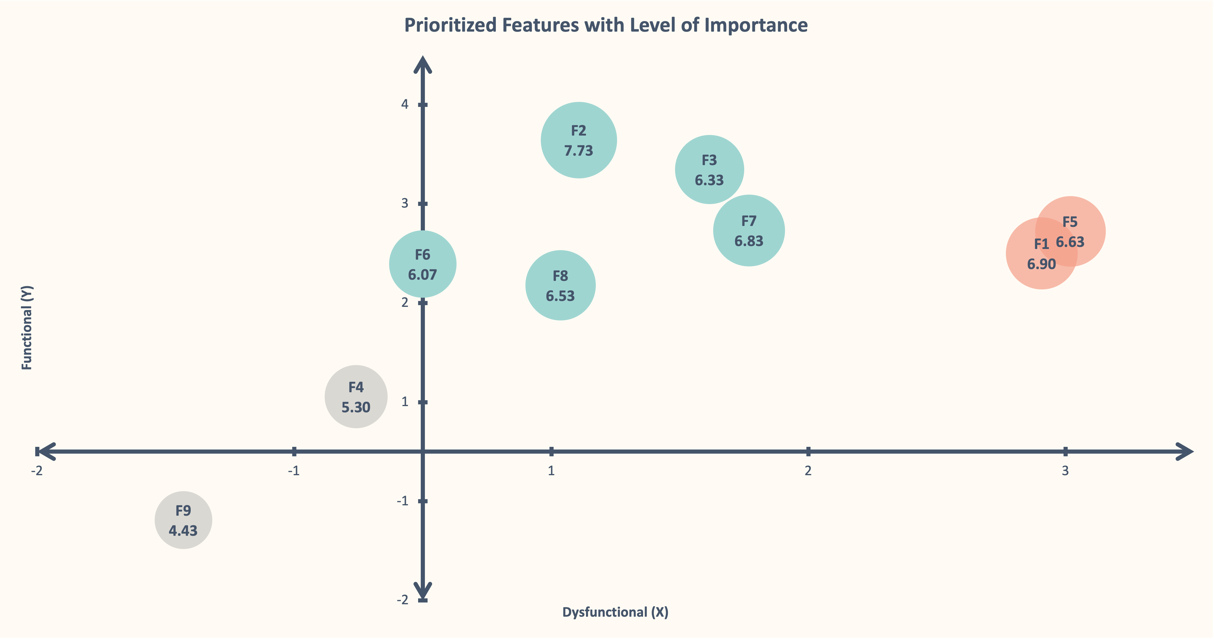
We can categorize features within a two-dimensional plane using these scores and focus on the positive quadrant (black square).

When passing the survey results and categorizing each answer with a score, you’ll end up with something very similar to this:

Categorizing the features
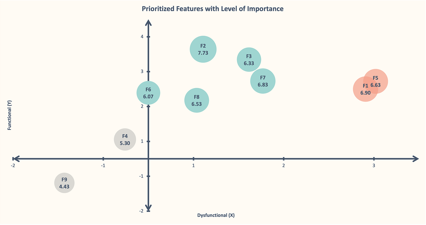
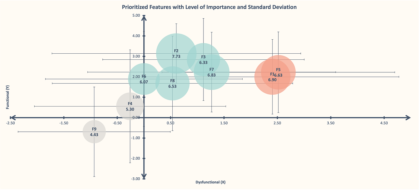
From now on, we’ll use a lot of averages for each feature. We need to calculate for every answer the average Functional, Dysfunctional and Importance. Also, the Standard Deviation of those 3 scores (Formulas and process are included in the Excel file).
So taking each Functional and Dysfunctional score we’ll help us understand in what part of the quadrant is the feature.

In the Excel file, I used features based on a hypothetical task manager app with hypothetical answers also for this practice guide. Here’s how it looks:
By adding the importance factor will not only help us to give it a size to those bubbles, yet to easily compare features with similar position or size.
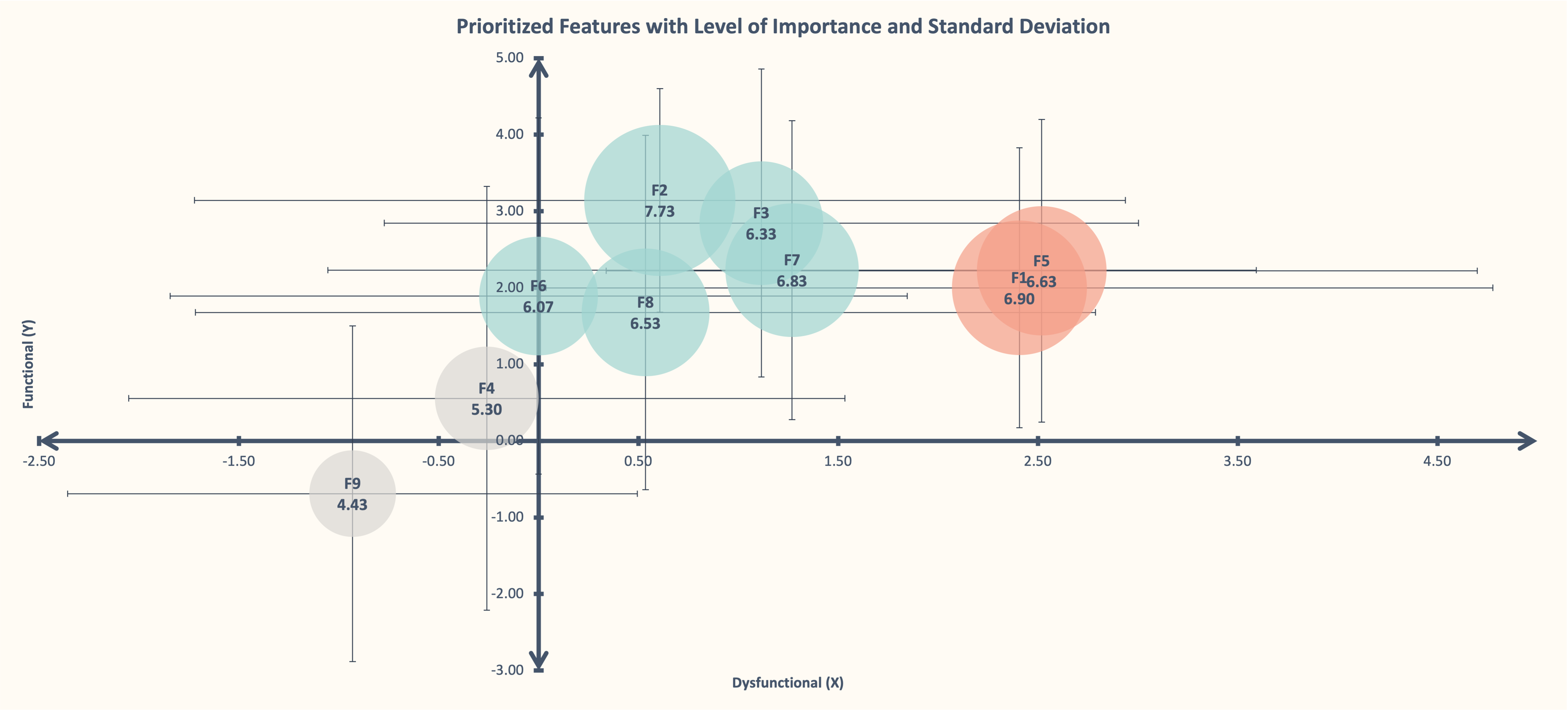
Finally, we add the Standard Deviation as Error Bars (in Excel). By doing this to a graphic helps to show the possible variations in data and gives a better understanding of the accuracy of categorizations.
Final thoughts
Incorporating Kano into our decision-making process can help us prioritize features, understand customer preferences and even enhance customer satisfaction. Depending on what you’re building, should be seen as a starting point rather than a definitive solution.
Kano provides valuable insights into customer satisfaction and can guide product development, but it's essential to remain adaptable. As customer expectations shift and new innovations emerge, we must continuously reassess and refine our approach to ensure we are delivering the best possible products and experiences.
This was definitely very complex to explain and I feel like I could deep dive much more. Let me know in the comments if you would like to know more about how the spreadsheet works or if you use a better approach!
This process seems like it would be super helpful navigating through tons of feature ideas. Thank you for sharing.
This is a great, detailed guide to leveraging the Kano model. Plotting the numeric feature values in a data visualization is a cool idea, so thanks for sharing the template. I also like the faces you drew for the functional and dysfunctional matrix :)